Design Customization
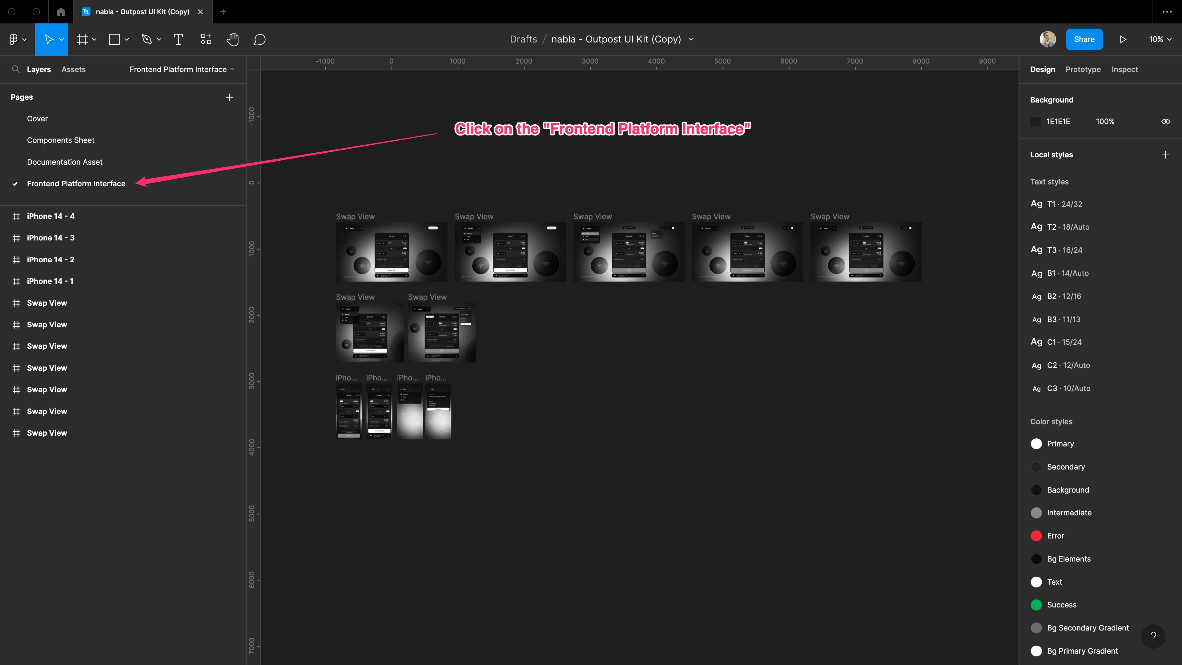
We provide you the Figma link to the design of the dummy nabla outpost platform. This contains the "component sheet" page containing the whole set of components, a "documentation asset" page with all the assets used in this documentation and a "Frontend Platform Interface" page containing some example screens of a custom outpost platform interface. The following tutorial shows you the steps to create your custom design version of the platform by simply editing the colours, label and logo.
The result of a such a process, will give you a design showing what you will get if you follow the instructions on the customization guide creating a code implementation associated to the colours code you set on the Figma file.
To better understand how the color are linked to the elements in the platform, please give a look at the Theme Customization page.
1. Duplicate the Figma file
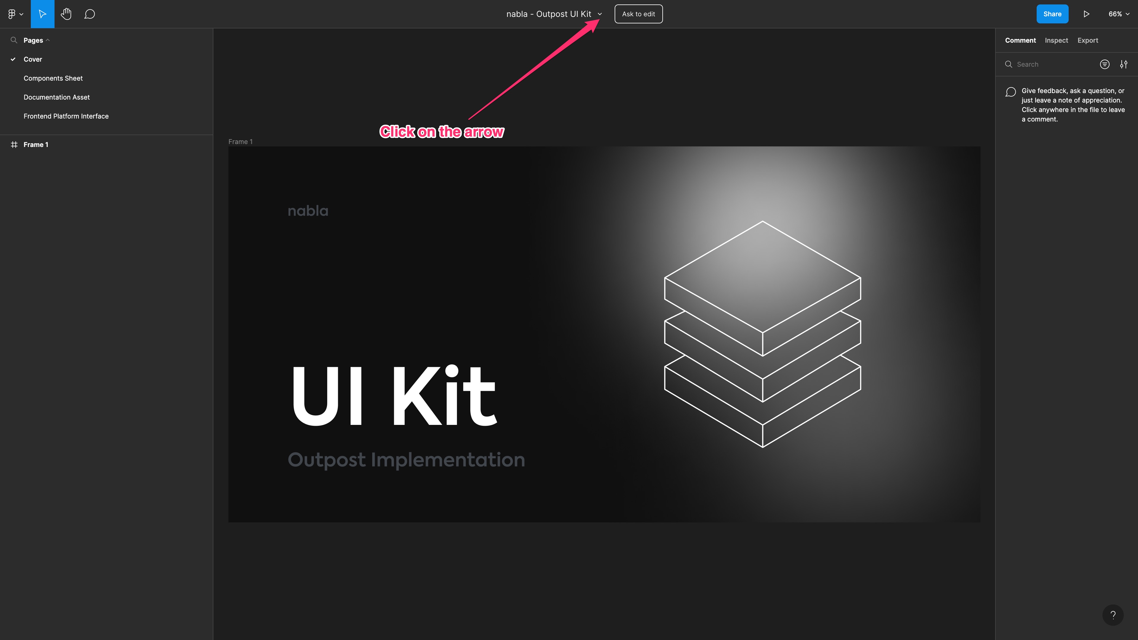
Click on the Figma link and access the Figma file. Then, click on the arrow next to the "nabla - Outpost UI Kit" label on the top center of the page.
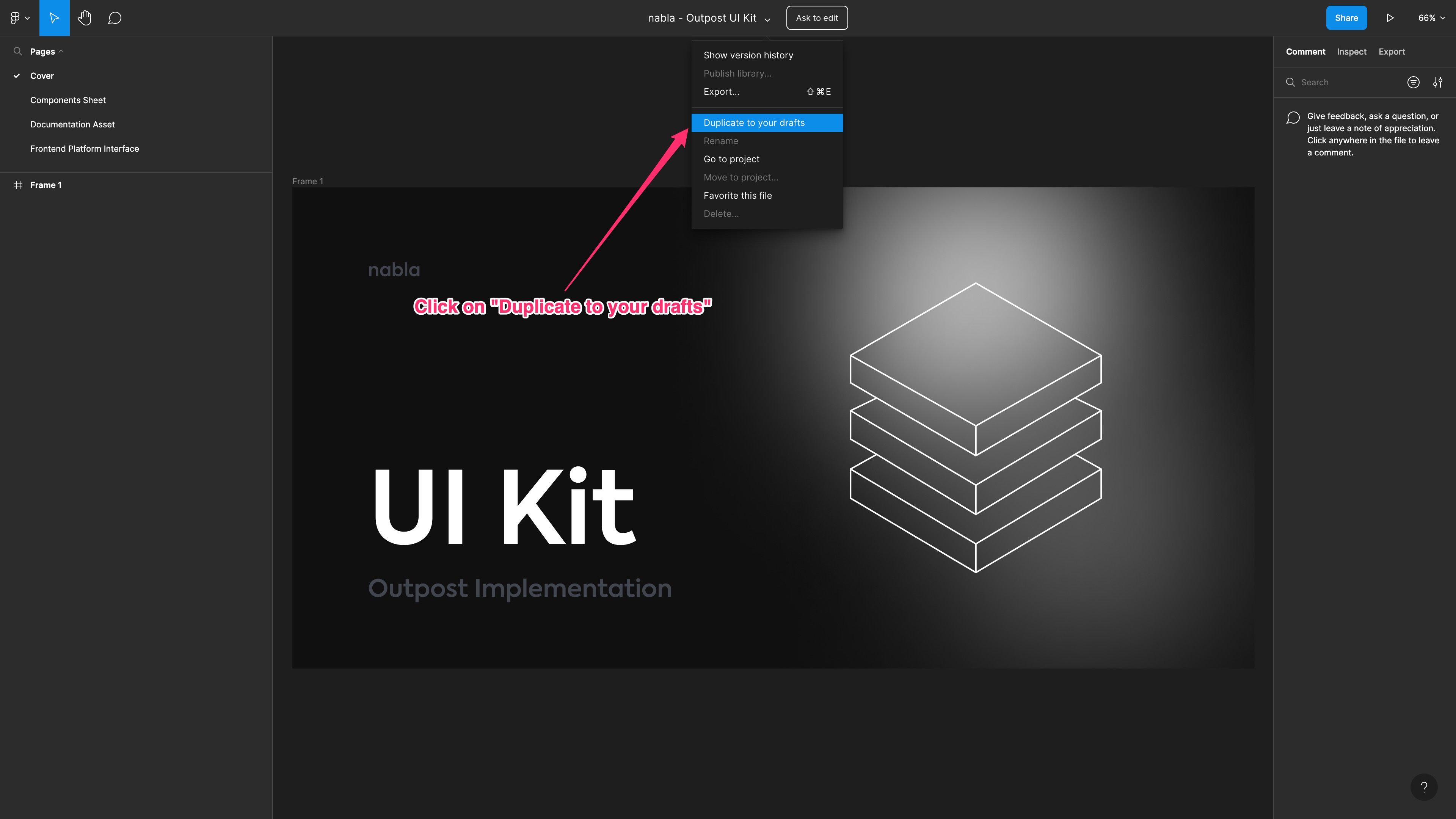
Now, you can duplicate the file to your draft, so you can use it and customize it as you like.
2. Reach the customizable components
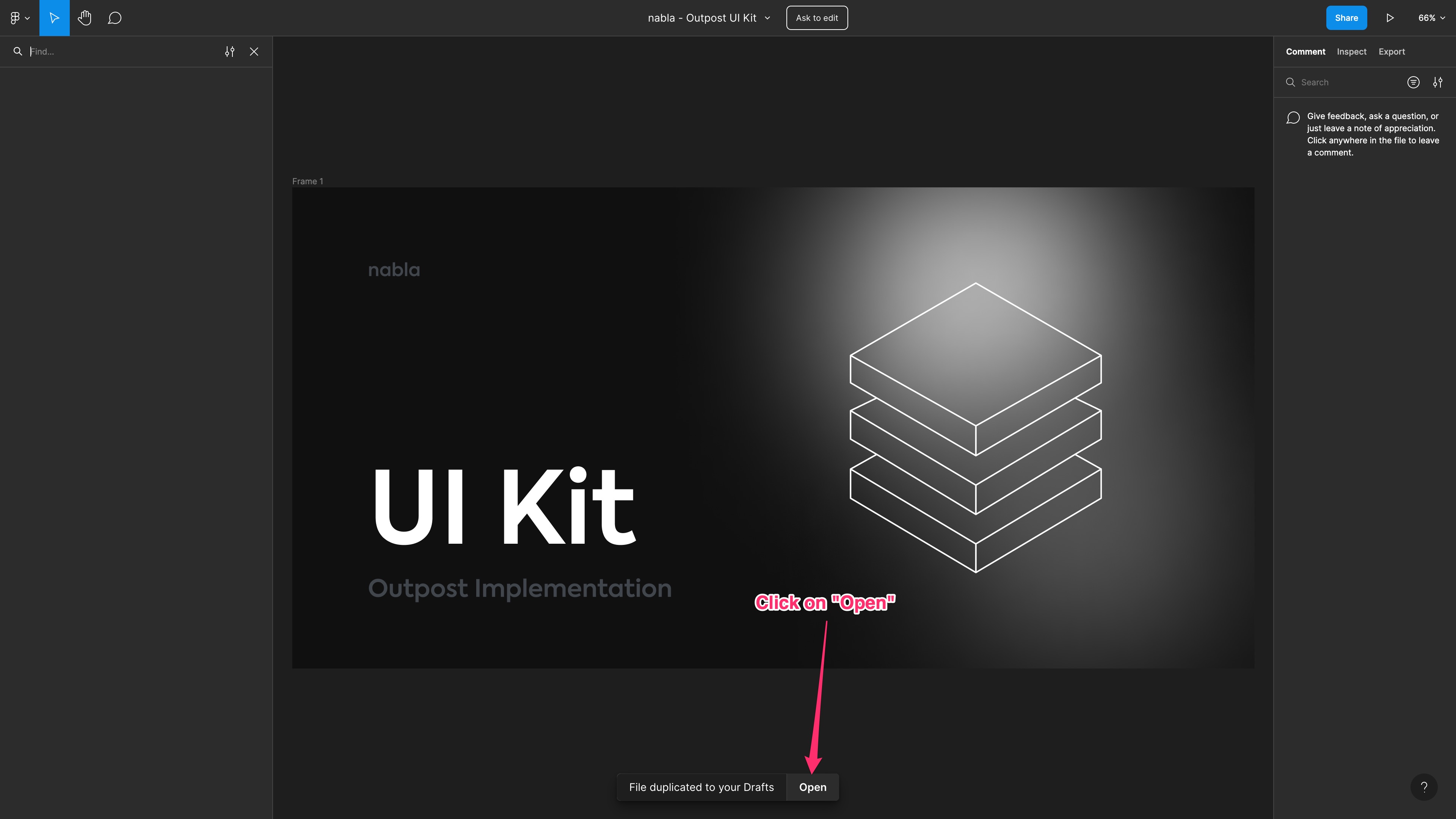
Click on the "Open" button, which will open the newly created file. It is your own copy of the original design Figma file, and you can modify it as you like. You are also able to perform modification on the components and deeply modify the final result, but if you only want to style the dApp with your brand colours, you can simply follow the next steps.
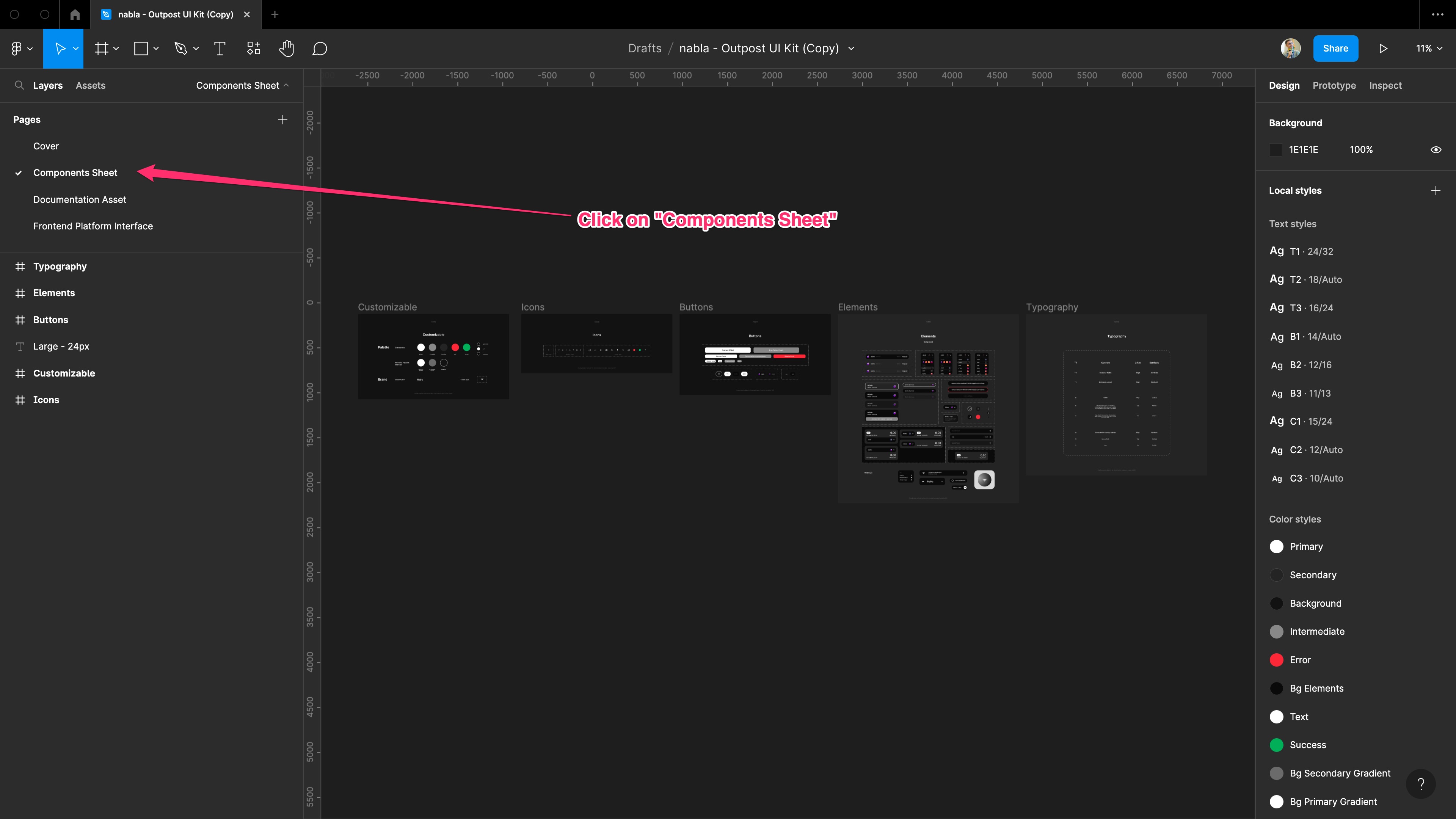
Then, you can click on the "Components Sheet" page on the left sidebar to see the page containing the customizable elements.
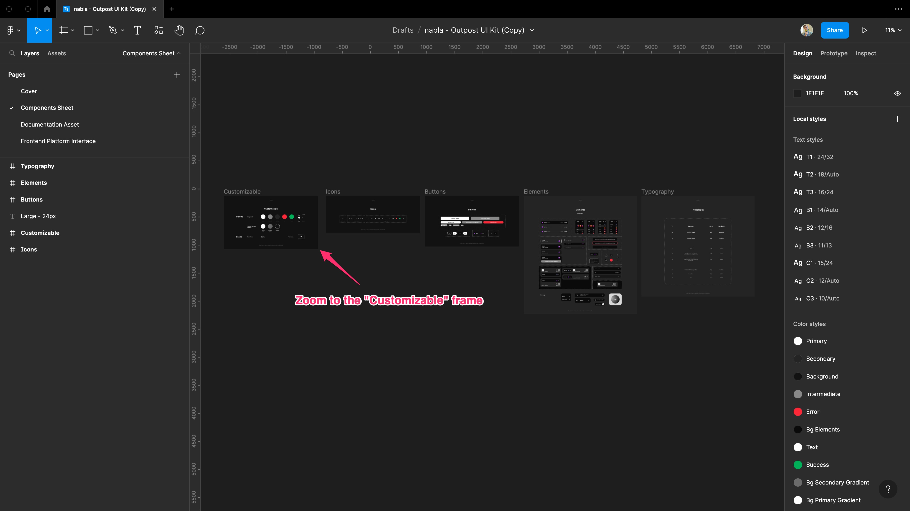
Now, you can zoom to the "Customizable" frame (which is the first on the left).
3. Set the colours palette
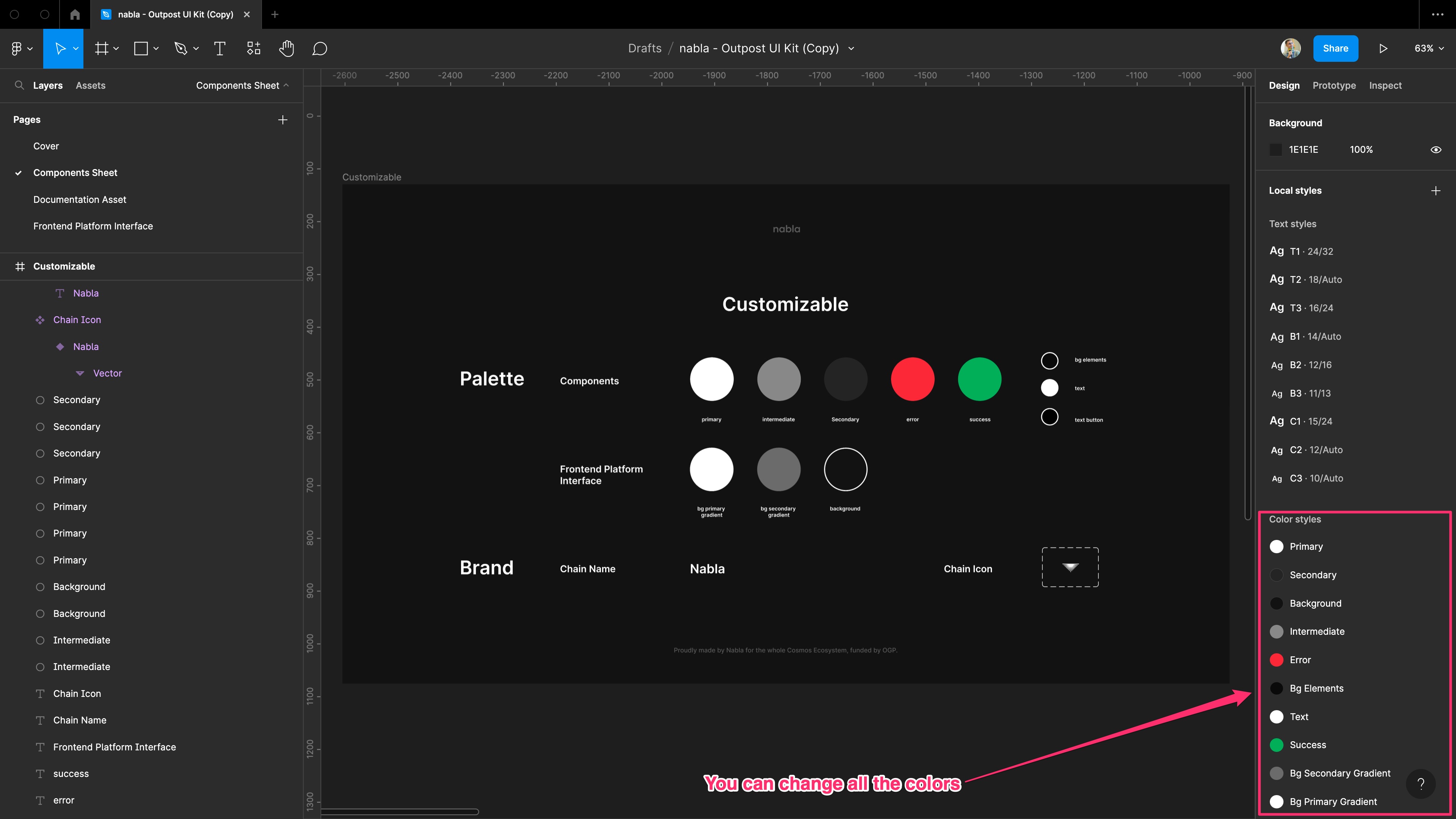
Once you reach the customizable frame, you can see the basic components which can be modified with a very low effort and which could provide a nice result in terms of brand styling of the platform. From here, you can change all the colours available on the right sidebar. While changing the colours on the right you will see the corresponding coloured circle changing on the frame.
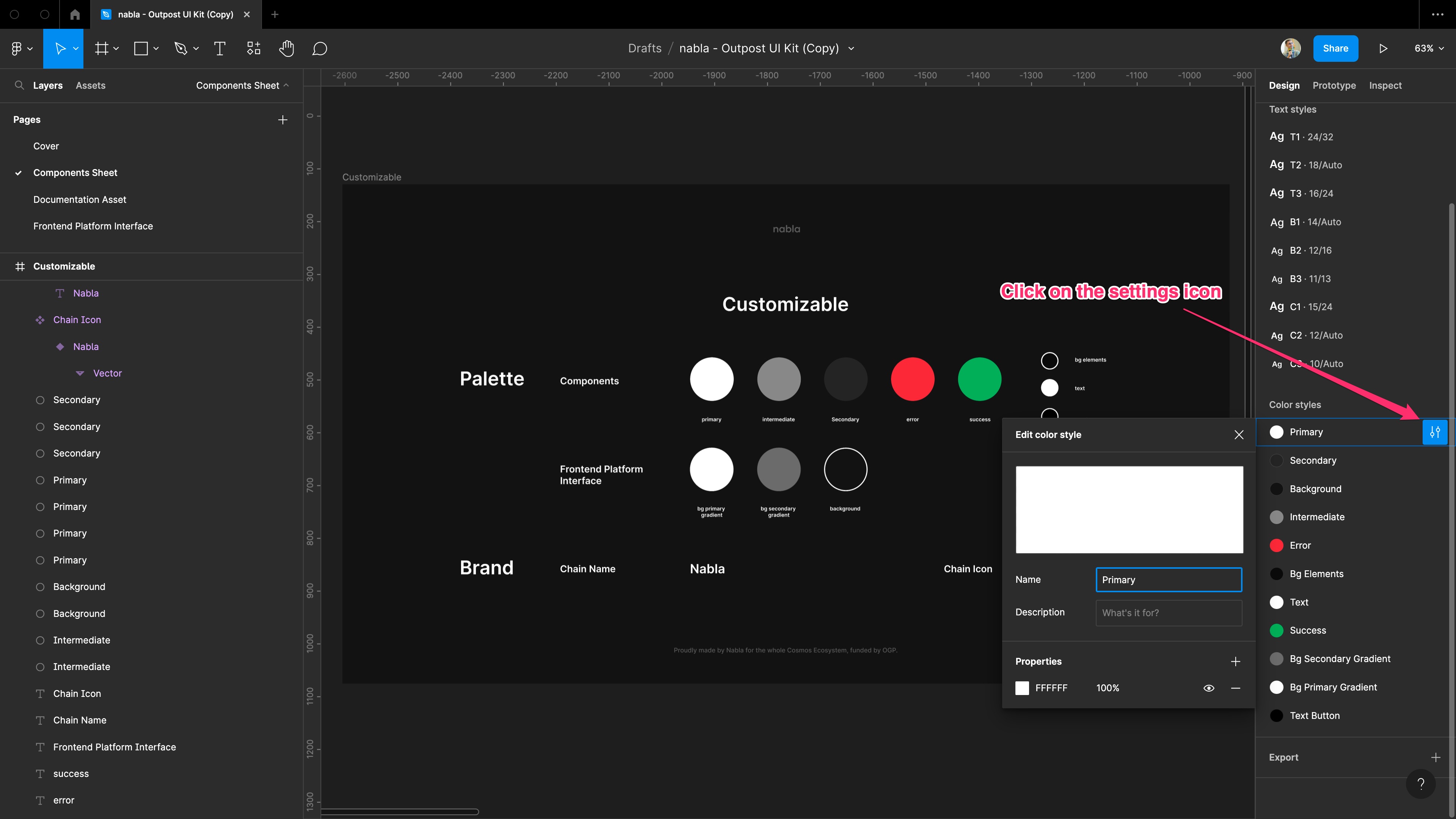
To edit a colour, first you need to click on the settings icon that appears when you hover the colour with your pointer.
Then, you need to click on the coloured box which appears on the bottom left part of the newly opened popup.
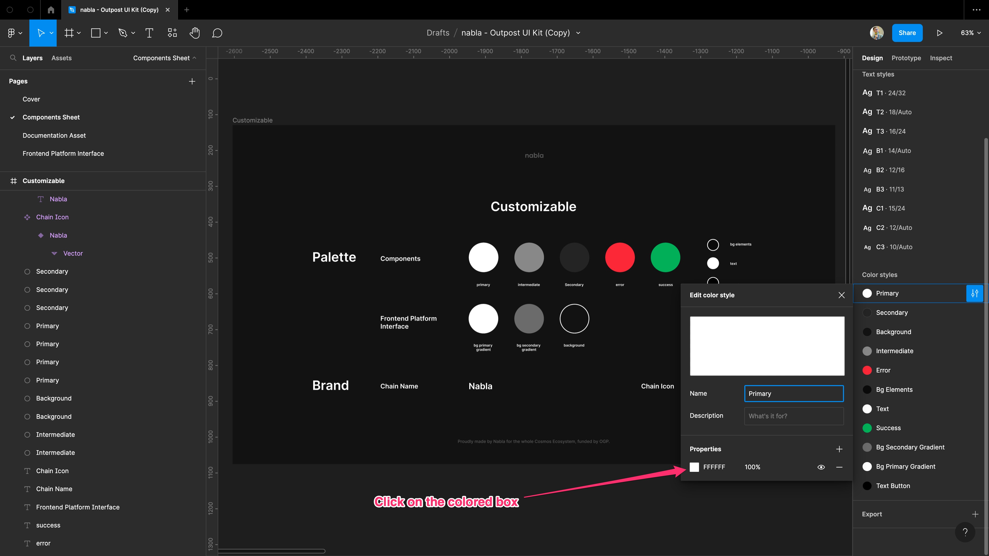
At this point, you can select a color from the selector. You can both use the colour picker, select the color by using the sliders, and select a method like RGB, Hex, HSL and so forth.
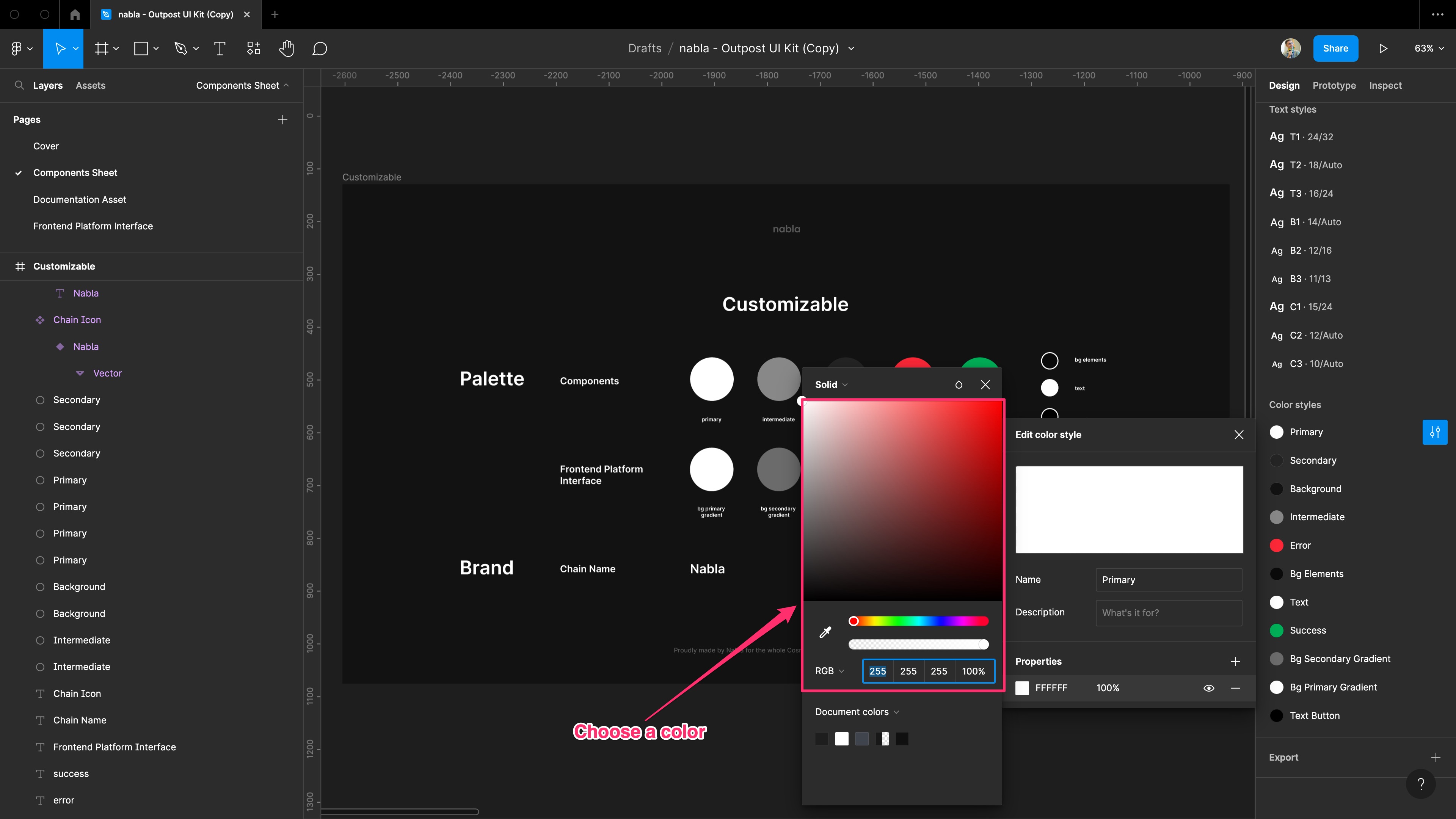
You need to repeat these steps for any colour you want to change.
4. Set the chain metadata
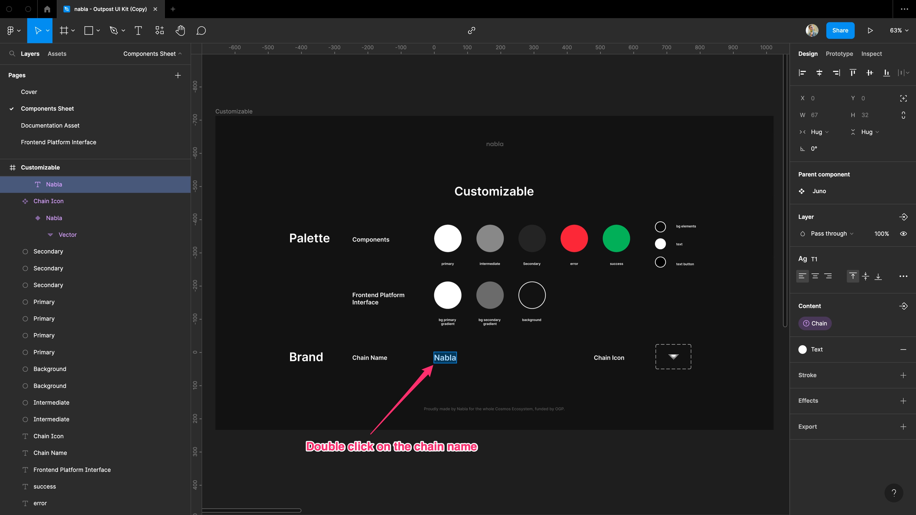
In the end, you can change the chain name and chain logo. To change the chain name, double click on it. First to edit it, ensure that you selected the "Nabla" layer on the left sidebar. You need to overwrite it.
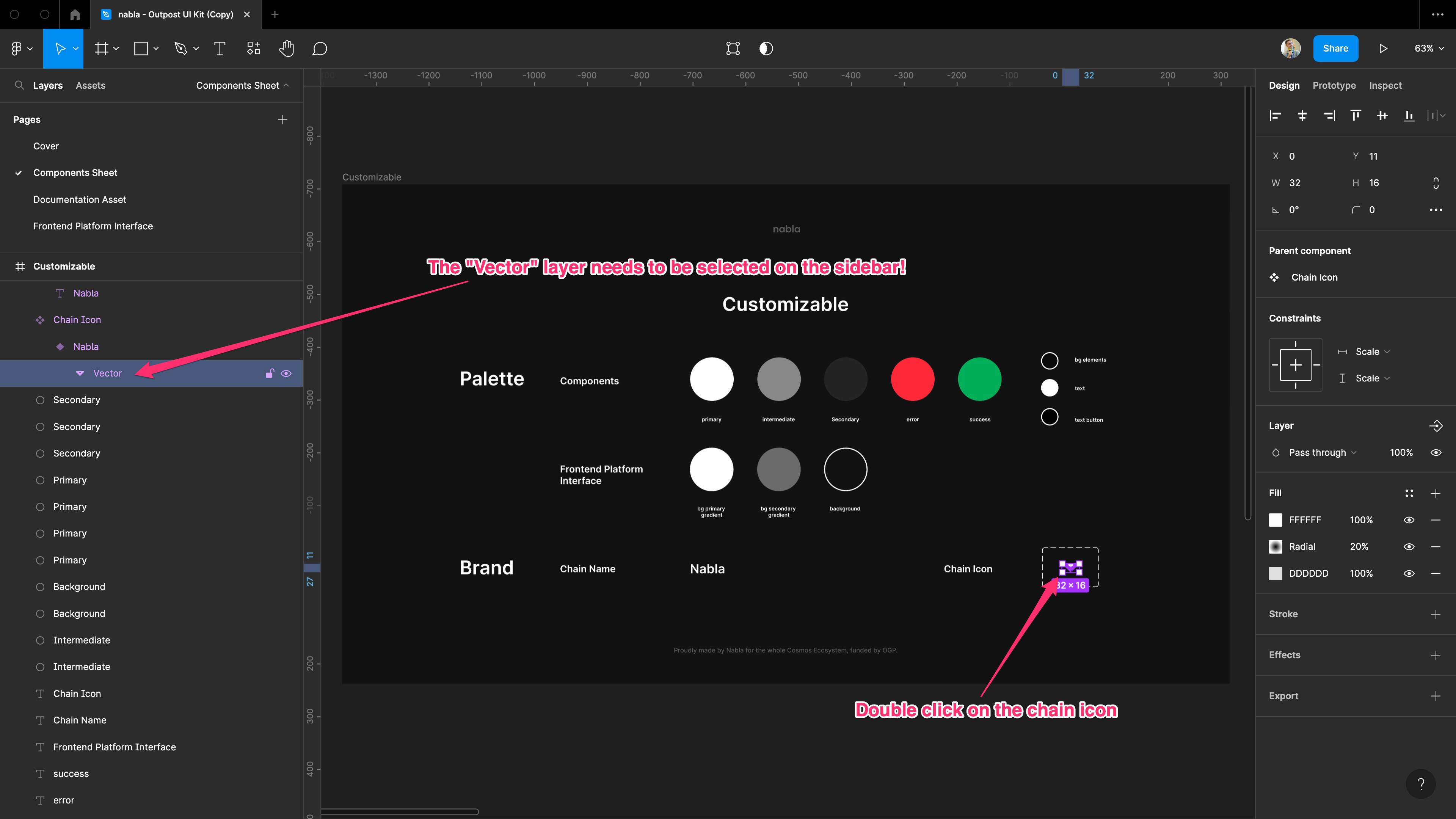
Similarly, you can change the chain logo. To do it, you can double click on it. Before to modify the image, ensure that you selected the "Vector" layer on the left sidebar. You need to overwrite it.
Logo generation guidelines
The logo to provide must agree the following:
- frame width: 256px;
- frame height: 256px;
- background color: transparent;
- colour: single-color WHITE;
- format: *.svg;
We attach some examples (Nabla, Osmosis and Juno) of logos to give you a guideline. Please, access this page in dark mode to have a better experience.
| nabla | Osmosis | Juno | ||
|---|---|---|---|---|
5. Enjoy the result!
And... you are done! Now to enjoy the results of your efforts, you can reach the "Frontend Platform Interface" page and see the mockup you realized!!
